Environment Design: Uncovering diverse user needs for GIS maps

Uncovering Diverse User Needs for GIS Maps
The goal of this 3 month project was to reimagine and develop a concept website GIS product that displays environmental data in a new and meaningful way.
Teammates
Business Analyst
Assistant Business Analyst
Developers
GIS Advocates
Policymakers
Lawyers
PROBLEM
The Challenge

The current website information architecture is outdated and required a design refresh.
The current GIS product is not designed with the understanding on the difference between how internal and external users interact and search for environmental GIS data.
A redesigned GIS map tool with better navigation and search fields that allow users to easily access accurate and timely information from diverse environmental programs.
My Role
As the lead for the project, I provided project management support and was responsible for applying human-centered design best practices to uncover deeper level user insights to drive data-driven enhancements to Access Environment to help users search for environmental data in a simpler, faster and better way.
EMPATHIZING WITH USERS
Understanding what matters to users
Before I dug right into user interviews, I reached out to the contact centre to extract quantitative data collected from past years to better understand what were the most frequent type of customer calls received with regards to the GIS website tool.
Based the call centre analytics, I discovered that an overwhelming number of call inquiries were for “Search Assistance” and navigational issues rather than for IT related bugs. For instance, often a user would call and ask for the call centre staff to hand hold them through the website and to explain how to navigate the website GIS tool to search for Environmental Data in their neighbourhood.
Thus, one of our service goals focus was to reduce calls for navigational issues by creating a better search information architecture. This would give users the power to solve problems without the hassal to call a call centre operator.
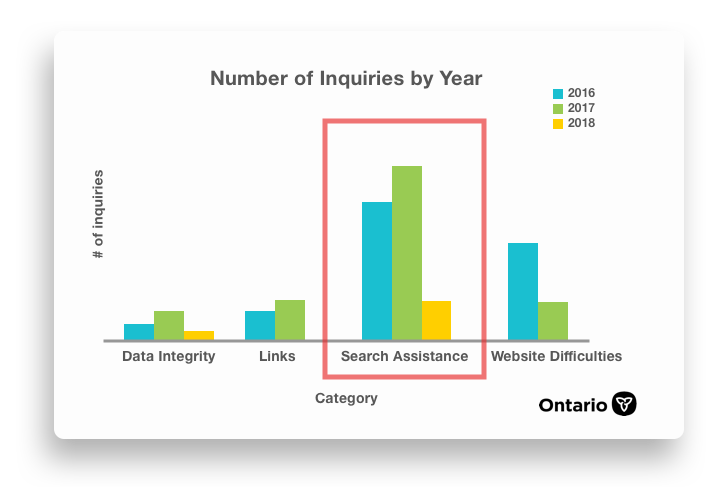
Why we should care about usability: “Search Assistance” was the leading type of Inquiries from 2016 - 2018
Learning about who we’re designing for
Field Visits | Contextual Inquiry
Speaking to the right people and understanding the problem in-depth was more important than speaking to a lot of people.
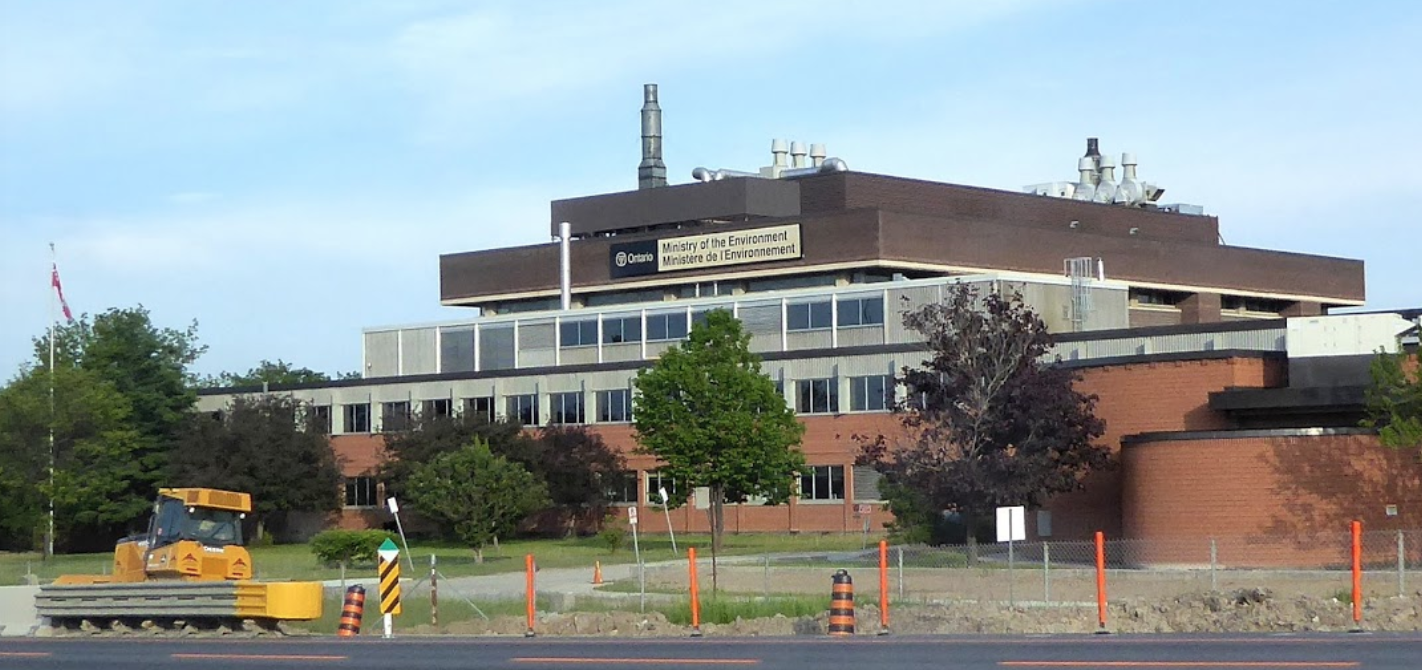
I conducted contextual inquiry by conducting one on one interviews in the field with 6 real users. I traveled to the offices of people who use the map tool and observed how they used GIS in their daily business workflow.
I preferred to use a “show not tell” approach because I was interested in observing the user in their natural work environment to better understand how the GIS tool was helpful (or not helpful). The observations were valuable between often I will uncover user behaviour and interactions with secondary or tertiary products that fill in a need to help users meet their information gaps which the primary product did not.
Also, speaking and understanding the users helped catch me up to speed very quickly on the wishlists and pain-points that gave me key insights in relevant contexts.
Key insights on user behaviour, motivation & values

Personas
When the field research was complete, I returned to the office to synthesize the finding and to look for patterns amongst the interview. The user insights helped us formulate personas for users with varying levels of comfort levels with the GIS software.

IDEATING
Brainstorming how to create value for users
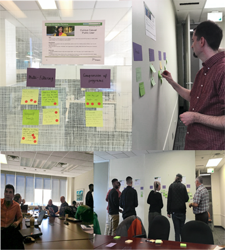
Design-thinking Workshop
After consolidated the themes, I chose to take the opportunity to invite the GIS IT team, program areas and policy staff that have interacted with the GIS tool to a design-thinking workshop. I facilitated the workshop with about 20+ GIS users to create user stories and prioritize features.
In the workshop we had some extreme users that had very poor experiences with the current GIS tool which gave us very valuable insights on the problems. Listening to extreme users help expose frustration, sparking creativity for us to improve the user experience.
Through the session new ideas came up which we haven’t considered before which led to the creation of a better value proposition in improving navigation, content and usability.
OUTCOMES
Optimizing the website based on user needs
After weeks of business analysis, user research and content modelling, I was able to deliver an evidence-based package with qualitative and quantitative research and concrete recommendations of high value priority list of identified by real users on how we can improve the navigation and information architecture for the website.
I delivered actionable insights in the form of a business case package that was moved forward in the organization which outlined a clear list of GIS enhancements that brought the most value for money to the organization.

These are the valuable lessons I learned about GIS design:
“What is the number one thing I would like to communicate on this map”? It is important to create visual information hierarchy to prioritize the features of the map. The use of colours, shapes and textures help users quickly consume large amounts of data points quickly.
More is not always better. Providing users with all the options at once on one page is overwhelming. Prioritization is key. It is best to present options that are most frequently accessed and serve the highest value to users in the first layer of options available.
Stay focused on most serious problems. The problems found exceeded the resources available to fix them. As a result it was important for me to help my team prioritize high value enhancements and agree on which problems are the most important to fix and how we’re going to move forward to fix them.